You’ve got about three seconds to make an impression online. Maybe less.
That’s it. Three seconds before someone decides whether your healthcare brand looks trustworthy or whether they’re clicking back to Google to find someone else.
In those three seconds, they’re not reading your carefully crafted copy. They’re taking in visuals. Colours. Layout. Typography. The overall feeling of what they’re looking at. And they’re making a snap judgment about whether you know what you’re doing.
This isn’t superficial. In healthcare, where people are making decisions about their health or their patients’ lives, visual identity isn’t decoration. It’s a signal of competence, care and credibility.
What we talk about when we talk about visual identity
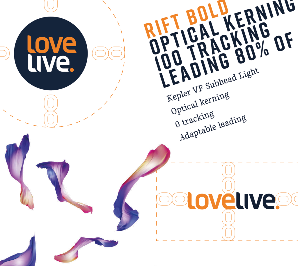
Visual identity is more than your logo, though that’s part of it.
It’s your colour palette. Your typography. The style of imagery you use. How you lay out information. The way all these elements work together across every touchpoint to create a consistent impression of who you are.
In healthcare specifically, these choices have to do some heavy lifting. They need to communicate professionalism and scientific rigour while also feeling approachable and human. That’s a harder balance to strike than you might think.
Get it wrong and you either look like you don’t take things seriously enough, or you look so clinical and cold that people feel alienated.
Why healthcare design actually matters now
Twenty years ago, patients had almost no choice in healthcare. You went to your local GP, took whatever treatment they recommended, used whatever pharmacy was nearby. Branding seemed irrelevant because there was no real competition.
That world is gone.
Now patients research options, compare providers, read reviews, and choose based partly on brand perception. They expect healthcare brands to reflect modern standards, which means clean design, good user experience, and clear communication.
HCPs are the same. They’re overwhelmed with information and drowning in options for products and services. The brands that make information easy to find and digest are the ones that get their attention.
This doesn’t mean healthcare should look like consumer tech. But it does mean the bar has shifted. People notice when your materials look dated or poorly thought through. And they draw conclusions about your competence based on those signals.
How colours and fonts shape perception
There’s actual psychology behind why certain design choices work in healthcare and others don’t.
Take colour. You rarely see bright reds or harsh oranges in healthcare branding. Not because of some universal rule, but because those colours trigger associations with warnings and danger.
Blues and greens, on the other hand, test consistently as calming and trustworthy. That’s why half the healthcare brands out there use some variation of blue.
Typography matters too. Clean, modern sans-serif fonts convey professionalism and forward-thinking. Serif fonts can work but tend to feel more traditional. Script or decorative fonts are almost always wrong in healthcare because they sacrifice clarity for style.
Your logo needs to be simple enough that people remember it after one glance. Complicated logos with too many elements don’t stick. And in healthcare, where trust compounds over time, you want people to recognise you instantly when they see you again.
Making people feel seen
Trust doesn’t come from looking polished. It comes from making people feel like you understand them.
This is where human-centred design comes in. Your website should be easy to navigate, not just because that’s good practice, but because struggling with a confusing interface makes people anxious. And anxious people don’t trust you.
Your imagery should show real diversity. Not tokenistic diversity where you tick demographic boxes. Actual representation that helps different people see themselves in your story. When a patient visits your site and sees someone who looks like them, in a situation they recognise, they relax slightly. That tiny shift matters.
For HCPs, human-centred design means respecting their time. Clear diagrams instead of dense paragraphs. Visual hierarchies that help them find key information quickly. No jargon unless it’s genuinely necessary. They appreciate brands that make their job easier, not harder.
Why consistency is everything
Here’s where most healthcare brands fall apart. They’ll have a decent logo and nice colours, but then their website looks nothing like their brochures, which look nothing like their pitch decks, which look nothing like their product packaging.
Every time someone encounters inconsistent branding, they question whether you’ve got your act together. If you can’t maintain visual consistency across your materials, what does that say about the consistency of your product or service?
This isn’t about being rigid. Different channels need different approaches. A LinkedIn post looks different from a patient information leaflet. But the underlying identity – the colours, the fonts, the visual style, the tone – should be recognisable across all of them.
Consistency also builds recognition. When patients or clinicians see your brand repeatedly looking the same way, it reinforces your presence in their mind. Inconsistent brands have to start from scratch every time.
Getting practical about implementation
None of this matters if you can’t implement it across your organisation.
You need proper brand guidelines. Not a 100-page document that nobody reads, but a practical resource that shows your team exactly how to use your visual identity. What colours go where, which fonts to use when and how to handle your logo in different contexts.
You need a centralised asset library where people can grab the correct, up-to-date versions of your logo, templates and approved visuals. Nothing kills brand consistency faster than different teams working from different, outdated files.
And you need buy-in from stakeholders. Sales needs to understand why they can’t just make their own presentation templates. Marketing needs to see how brand consistency supports their goals. Leadership needs to recognise that this isn’t cosmetic, it’s strategic.
The long game
Building trust through visual identity isn’t a quick win. It compounds over time and activity.
Every time someone encounters your brand and it looks professional, considered and consistent, you make a small deposit in the trust bank. Do this repeatedly over months and years, and you build real equity. People know who you are. They trust what you do. They choose you over competitors.
The brands that skimp on visual identity or treat it as an afterthought spend years trying to rebuild credibility. The ones that invest properly from the start have a foundation that supports everything else they’re trying to do.
How LOVELIVE can help
Since 2010, we’ve worked with healthcare innovators who need to communicate complex ideas to demanding audiences. We get the regulatory constraints, we understand the multiple stakeholders, and we know how to translate technical innovation into compelling stories.
What we do:
- Brand identity and visual systems
- Creative strategy and messaging frameworks
- Data visualisation and diagrammatic storytelling
- Website UX/UI and service-explainer content
- Pitch decks, proposals and investor-facing materials
- Illustration, animation and motion graphics
- Report and insight publication design
Want to see our healthcare credentials? Fill in the form below and we will get in touch